TorahAnytime App
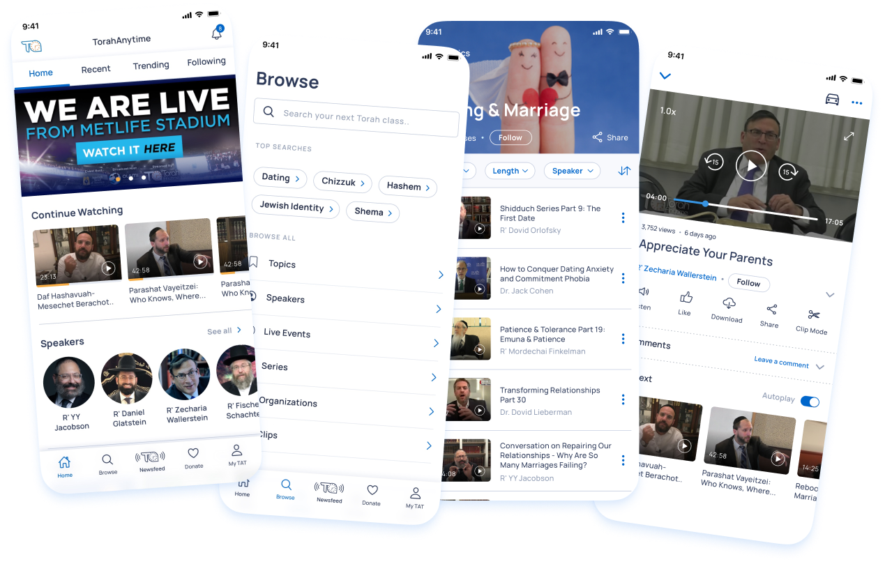
Creating the User Experience of an app that helps users access their favorite classes and speakers. This redesign focused on Native mobile apps, we designed and tested for iOS and Android.
I owned and led the design of the app bringing user visibility and insight to every decision. I partnered with the dev team on the build and data collection.
My Role
Product & UI Design
User Research & Testing
Timeline
9 months (approx 250 hours)
Company
TorahAnytime

The brief
Background
TorahAnytime is the largest library of originally recorded Torah (=Bible) classes in the world (think Youtube of Torah classes 
Initial Problem Statment
The original TorahAnytime App was launched in 2014 and had many downloads (100k+). The classes were an instant hit but the repeated user feedback was that the usability was limited and the screens were confusing.
And so, as the numbers dropped, the team realized there was a need to invest in proper UX and UI for a delightful video and audio app experience.
BUSINESS GOALS & STRATEGY
High-level goals
Team KPIs:
Increased downloads and active sessions
Positive feedback - App reviews
Sharing metrics
01/ Interaction with content
Users to be able to Watch, Listen, Share & Download.
02/ Customized experiences
Customized experience for signed-in users.
03/ Design goal
Clean-looking UI. TV app look & feel. Dark and Light modes.
Quantitative Research
Discovery & Research
Guided by this understanding of the user’s pain points, i dove into discovery & research to understand more. I started by analyzing usage data which plays a huge role in identifying problems. In addition, I led other discovery methods, a thorough audit of the app itself, competitor research, and user interviews 
1 / User data from the website
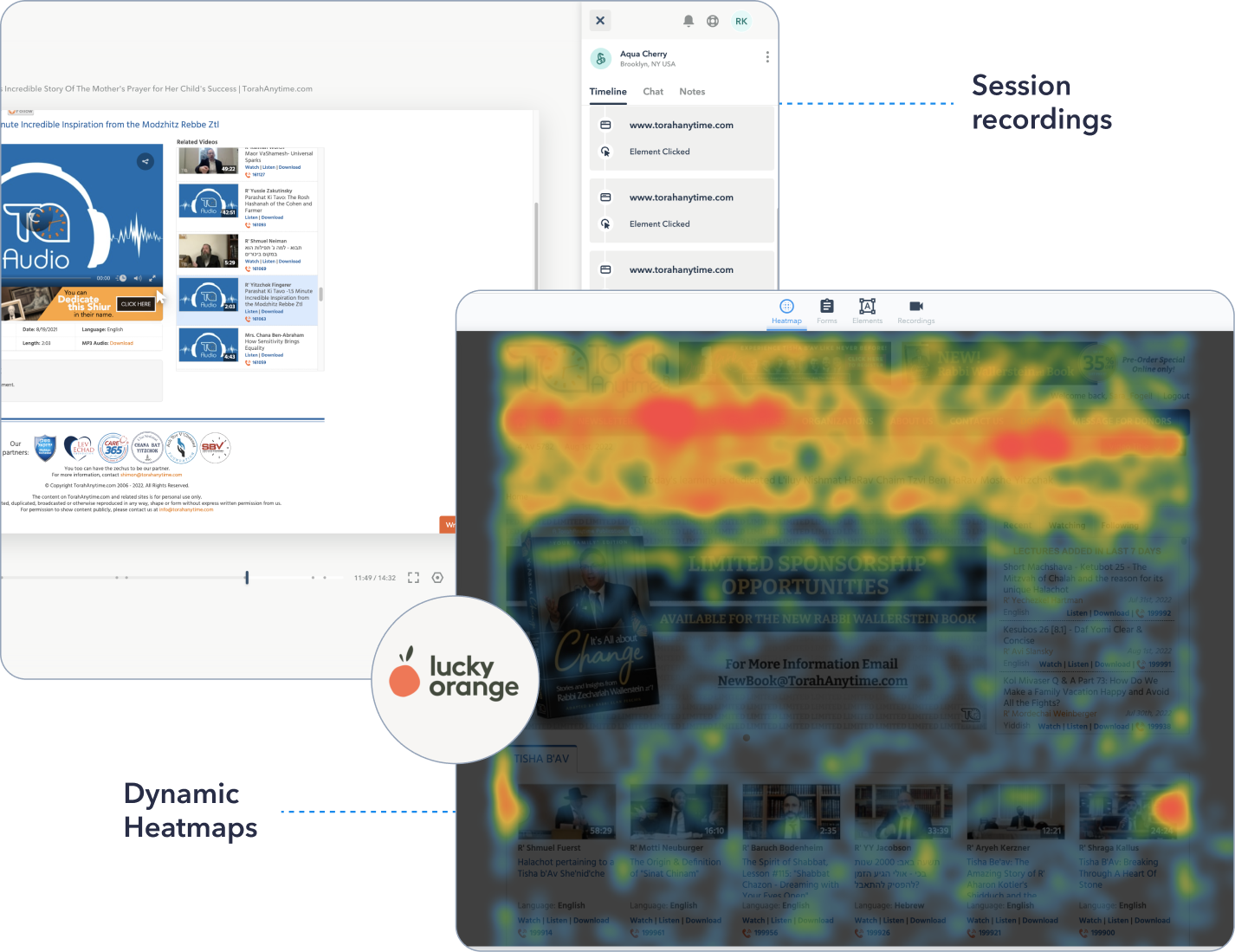
The TorahAnytime website has amazing traffic, so I started my discovery journey in understanding how our user engages with the content. I reviewed heat maps and screen session recordings until I found enough repeated patterns of the typical user journey.
2 / User data from the app
With the website data in hand, we looked into our app analytics platform in order to compare and contrast user activity. I learned a lot from the top tasks which were performed on the app, average session time, and demographic data on the users and their devices.


I analyzed the data patterns from quantitative and qualitative research
where we analyzed the data
Observations from usage data
→ Users rely heavily on Search. It is often one of the first actions they perform.
→ Users went first to time-related content (upcoming holiday/weekly class)
→ High frustration around the login flow requiring email verification with every sign in
Qualitative Research
Interviewing our team and users
1 / Team Feedback
Team insights are often on-point. And so, I took the time to chat with each of the team members and hear their useful suggestions for improvement.
2 / User interviews
I met with a couple of users to understand the end-to-end user experience of how they interact with the current system. Learning about their pain points in the process.
3 / User Survey
We conducted a poll asking users about their product preferences, technical issues they have experienced, and most importantly product opportunities.
Grouping all ideas into categories
We got so many good insights!
I used an affinity mapping method to divide the requests/feedback/insights into different types of app usage; how users interact with the content, how users interact with the app, and the features they were looking for to complete their experience.
This resulted in a list of prioritized user-requested features. woohoo!


to recap the research
Key highlights/main user pain-points
Engagement.
Users love the content and like to regularly interact with the app and speakers. They also like time-related content which is frequently updated.
Connectivity.
Users want to stay connected with cross-app/website synchronization and be able to watch while in other physical locations like driving or offline.
Customization.
Users want to interact with the content in their open personal way. They want the ability to search in different ways, build their own playlists, and bookmark for later.
Seamlessness.
Users were looking for plain easy login without an email link verifying their account.
Some of My own thoughts
App Audit

My overview of the app problems
Competitive analysis
Researching major competitors
I learned that the org leadership had a few apps which they loved and referred to quite often (Prime video, Free Cable TV, etc) so I did a deep dive into their screens, features, and user experiences 📱.
I came out with a better understanding of the video/audio experiences in leading and loved apps in the industry.
THE SOLUTION PROCESS - IDEATION
User flows & App Information Architecture
Once I had an idea of the content I moved to flow diagrams/app structure. My main aim in working on this IA was to make it simple and intuitive to navigate.
Mapping out the flow like this allowed me to visualize the screens and user flow while making sure to cover any edge cases.
At this point, with the general plan outlined, I initiated a meeting with the devs (get them in on the process early!), and together we discussed the dev efforts for each of the features. After this, the stakeholders made the ‘cut’ decisions that shaped the MVP app version.
BUILDING THE MVP PRODUCT
MVP Solutions
 Simple Sign in
Once per device. Introducing social sign in and ‘remember me’ functionality.
🔎 Browse, Filter & Choose
Browse to get inspired or search for specific results. Watch now or bookmark for later.
🍿 Watch & Interact
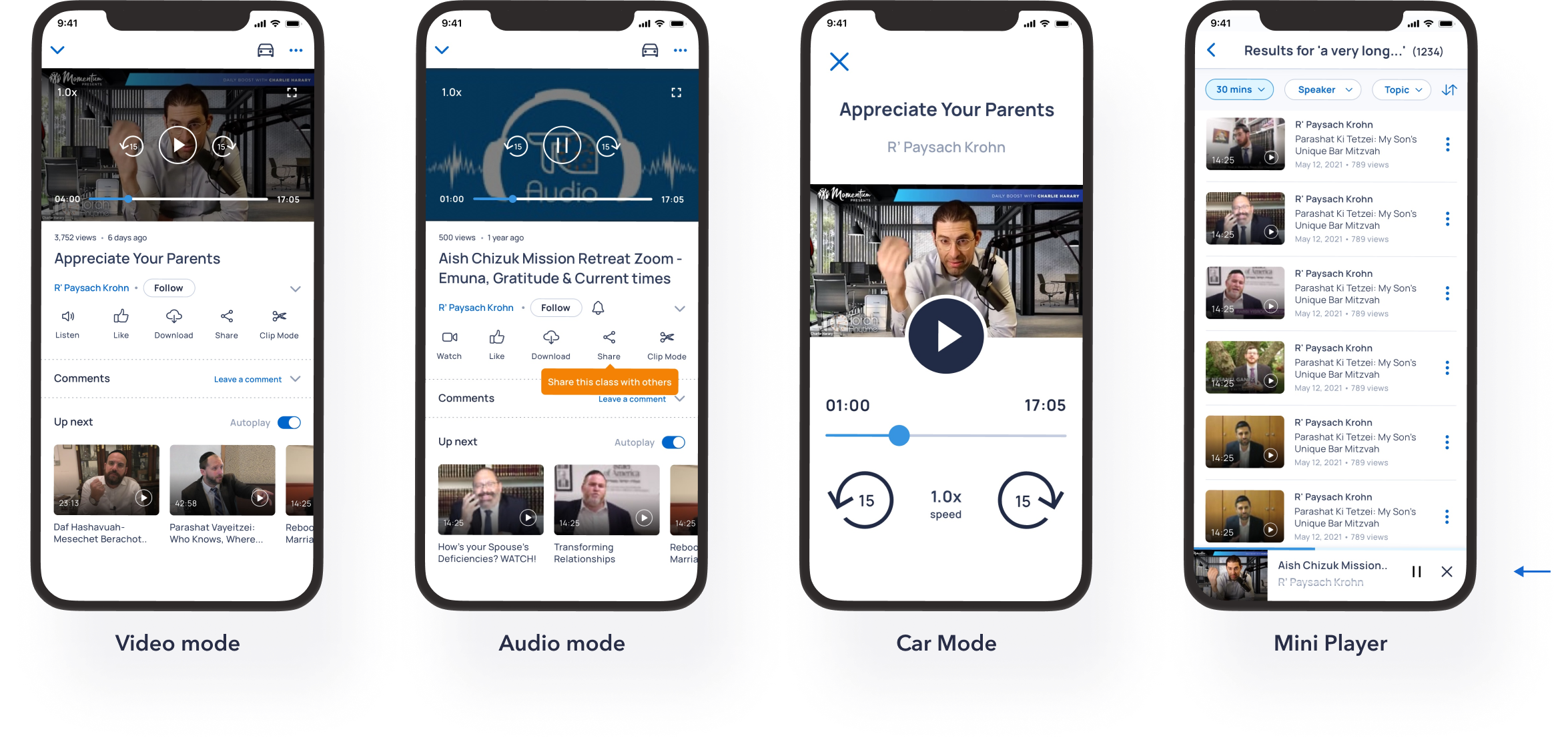
Watch classes in Video or Audio. Like, Comment or Download for when offline. Activate car mode.
Feature Spotlight #1
🗝 Simple Sign-in
Keeping in mind all the frustration we learned about regarding
the sign-in process. I had one goal in mind = make it simple.
Simple solutions:
- ‘Continue with’ is one screen for both sign-in and up = simple
- Based on the user’s email, the app determines the user’s status (signed up/new user) and directs them to the appropriate flow.
- Introducing Social sign up/in =quick and simple
- Only mandatory information is required during sign-up = simple.
- Open the email app for one-time account verification to ensure an active user list.

Feature Spotlight #2
🔎 Browse, Filter & Choose
In the next part, we were designing the main part of the user experience = discovering new content.
The questions we started out with were:
- When presenting a list of classes or categories do we want to fit more content in the space or give more detail to help the user with their decision? (quality vs quantity)
- Do our users read titles or pick a class based on the attractive thumbnail?

User browsing patterns
We decided to combine both options and design the screens according to the user's logic.
Home tab = grid view
The user scrolls through the Home page for a ‘library-like’ view of recommended content. They need to be able to compare items visually.
Other tabs = list view
In the other tabs, the user is searching for more specific results like what is new from the speakers/topics they follow or what is trending this week. The title and details are the most important details and the class thumbnail is supplementary.
Option A = Grid view

Option B = List view

Search, filter & find
This is the part of the app where users come to search by a specific term or explore a certain category.
Areas of focus:
- Recent and popular search queries
- Smart search algorithm
- Clear content hierarchy
- Popular filters to improve experience
- Item menu with key class actions

Managing personal lists
On the User Dashboard, users can manage their personal content with a few different types of lists. These lists are divided into categories based on usage data. The number next to each of the items indicates how many classes are in this list, making the user mindful of the content. The lists can be easily edited, managed, and shared.

Feature Spotlight #3
 Watch & Interact
This is the class player screen where users can watch and interact with the class they have picked.
During our user interview sessions, I learned that the user’s consuming mode is dynamic; they can start out listening in the car and then continue watching at the gym.
So the choice and switch between video and audio modes had to be at the forefront.
I also added the option to select a default viewing mode after detecting a repeated usage pattern of one of the modes for a few weeks on the app.

Player modes
Watch classes in Video mode or listen in Audio mode. Activate car mode when on the go or minimize to a mini-player to watch while browsing through the app.

Final thoughts...
The new app was released in August of 2021 and has been very happily received
The new app has been out for a year now and has 104k downloads so far on the new App (previously 43K a year) That's a 145% increase in annual downloads.
Active sessions stand at 1.5 hours on the average session which is a 250% increase.
The app has 6k 5-star reviews App reviews.
Key results after launch
104k
250%
6.2k
App downloads
Increase in sessions
5 star reviews

The app has 6k 5-star reviews App reviews.


