Admin Design System
Our company, Resident Home, creates inspiring home products. We built our own internal digital tool to meet our business needs and to manage our many brands and products. ‘Admin’ is a design system created for this internal business tool.
I led the design, creative direction, and documentation of the Admin Design system.
My Role
Creative Direction
User Interface Design
Timeline
2019 - 3 months
Company
Resident Home
It started with
Design Exploration
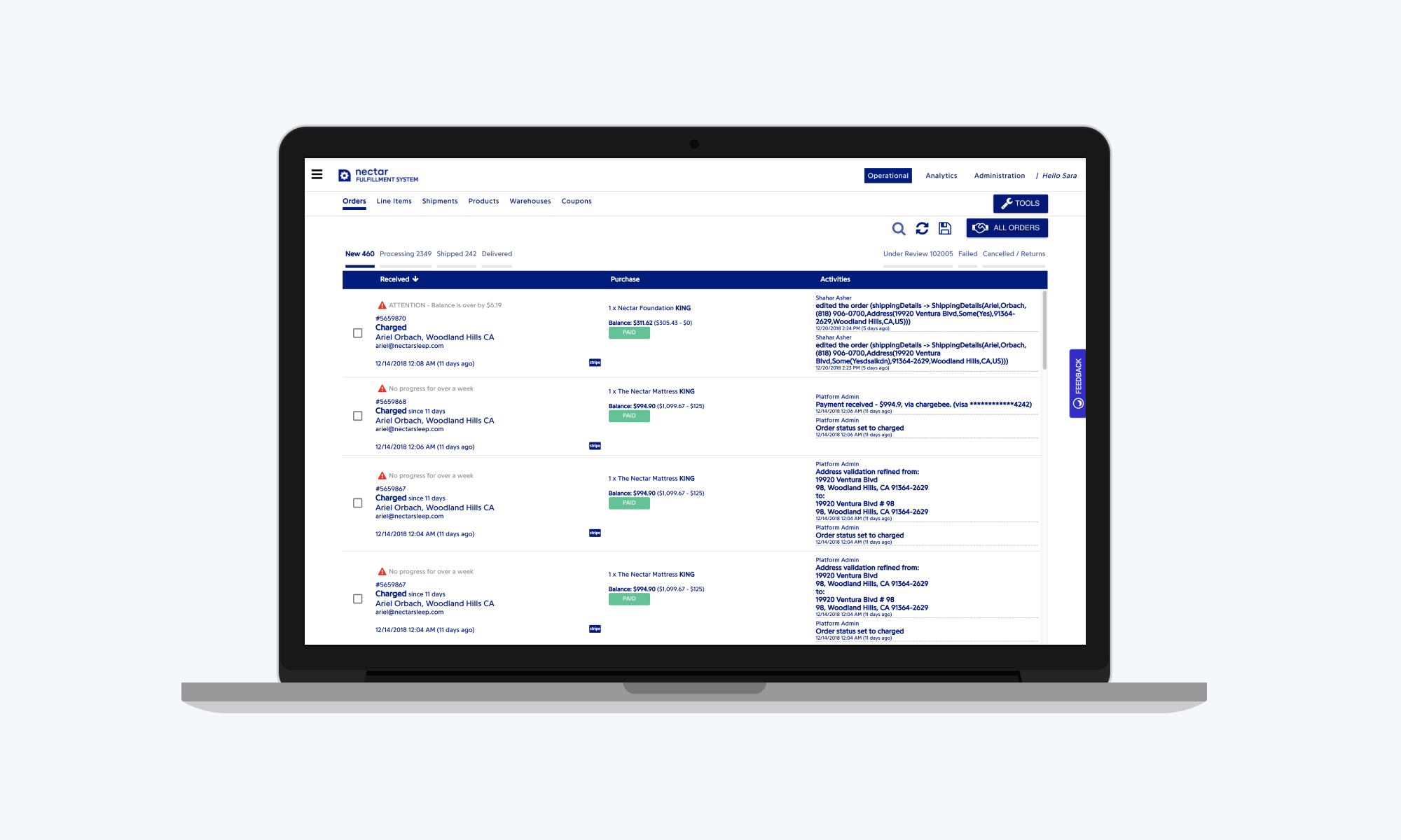
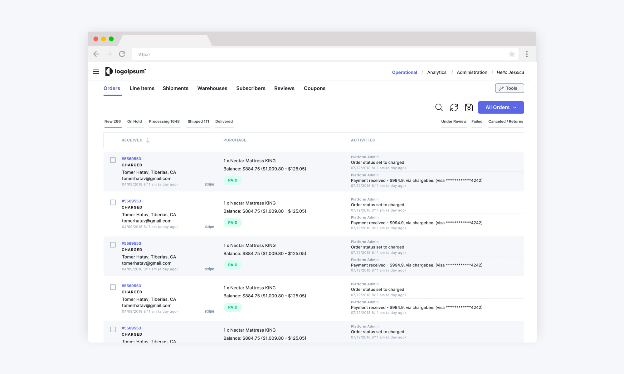
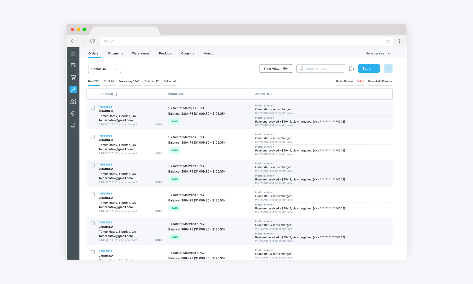
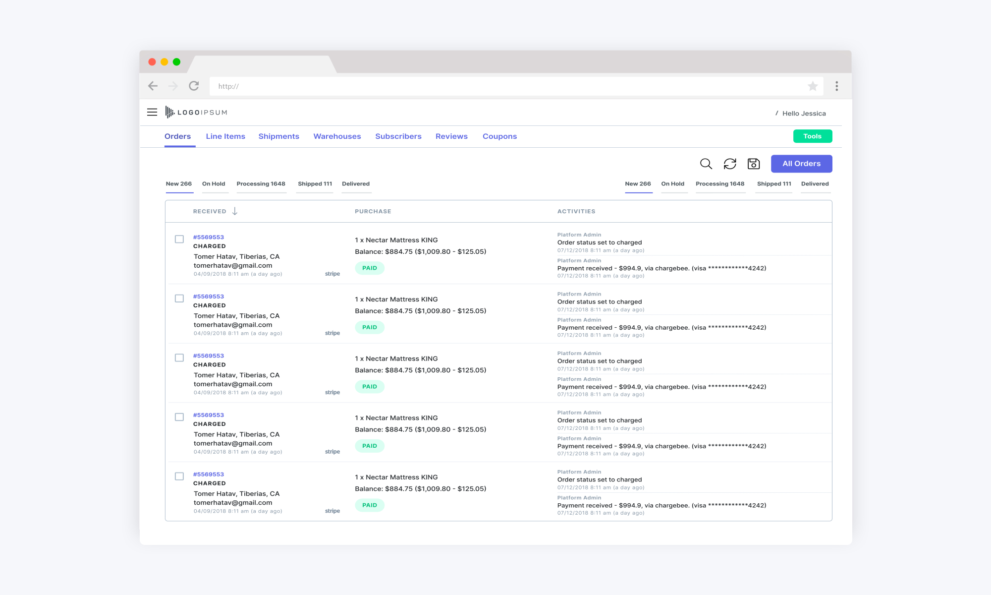
I started out experimenting with different styles and libraries of components and patterns. The direction, user interface (UI) and style changed over time, which is captured below.
Creative Direction
Simple, clear and clean
Our internal tools are all data-heavy, web-based products. Simplicity and readability are extremely important and so from the beginning, I knew I was going for a clear and clean aesthetic.
Color theory
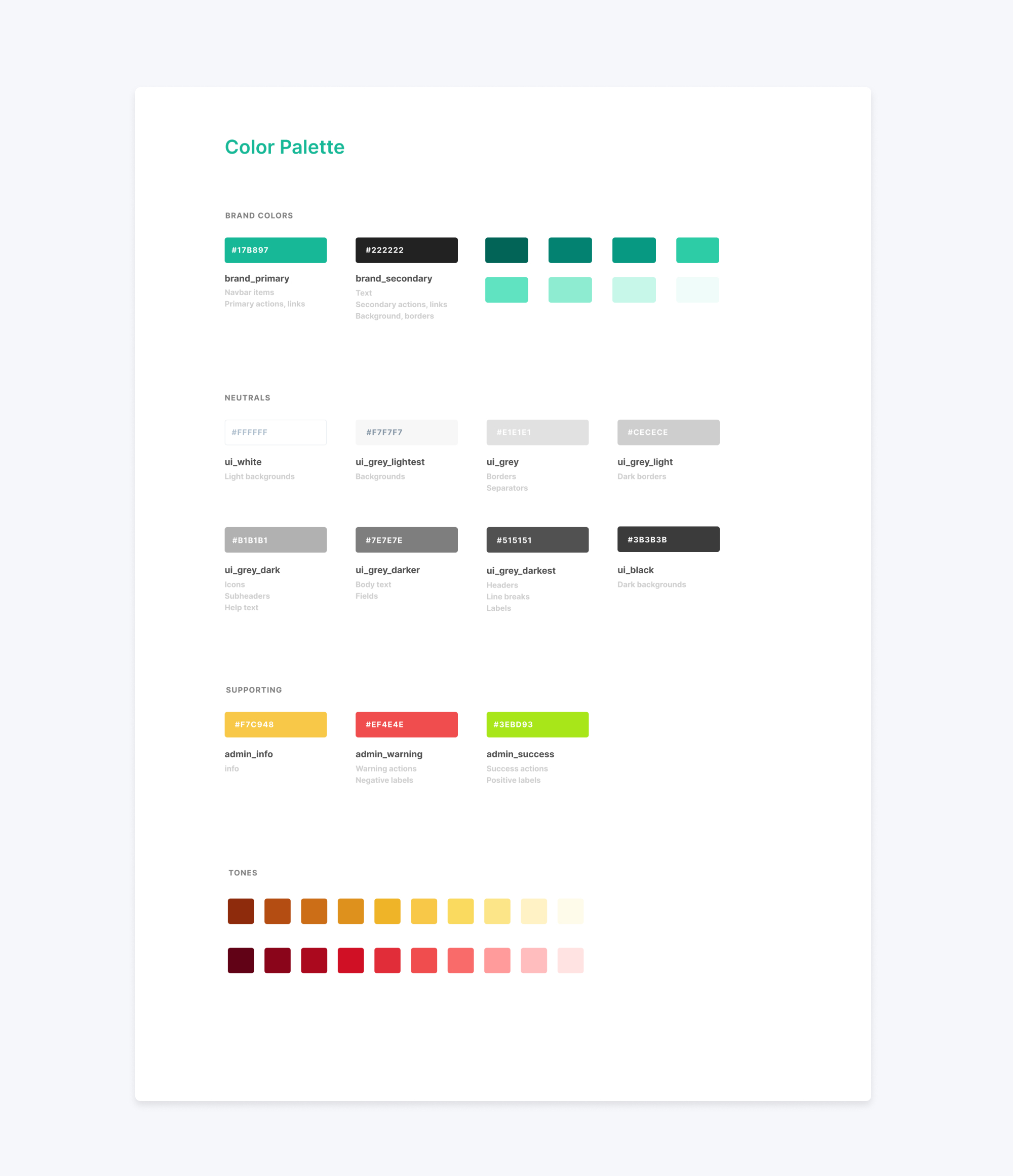
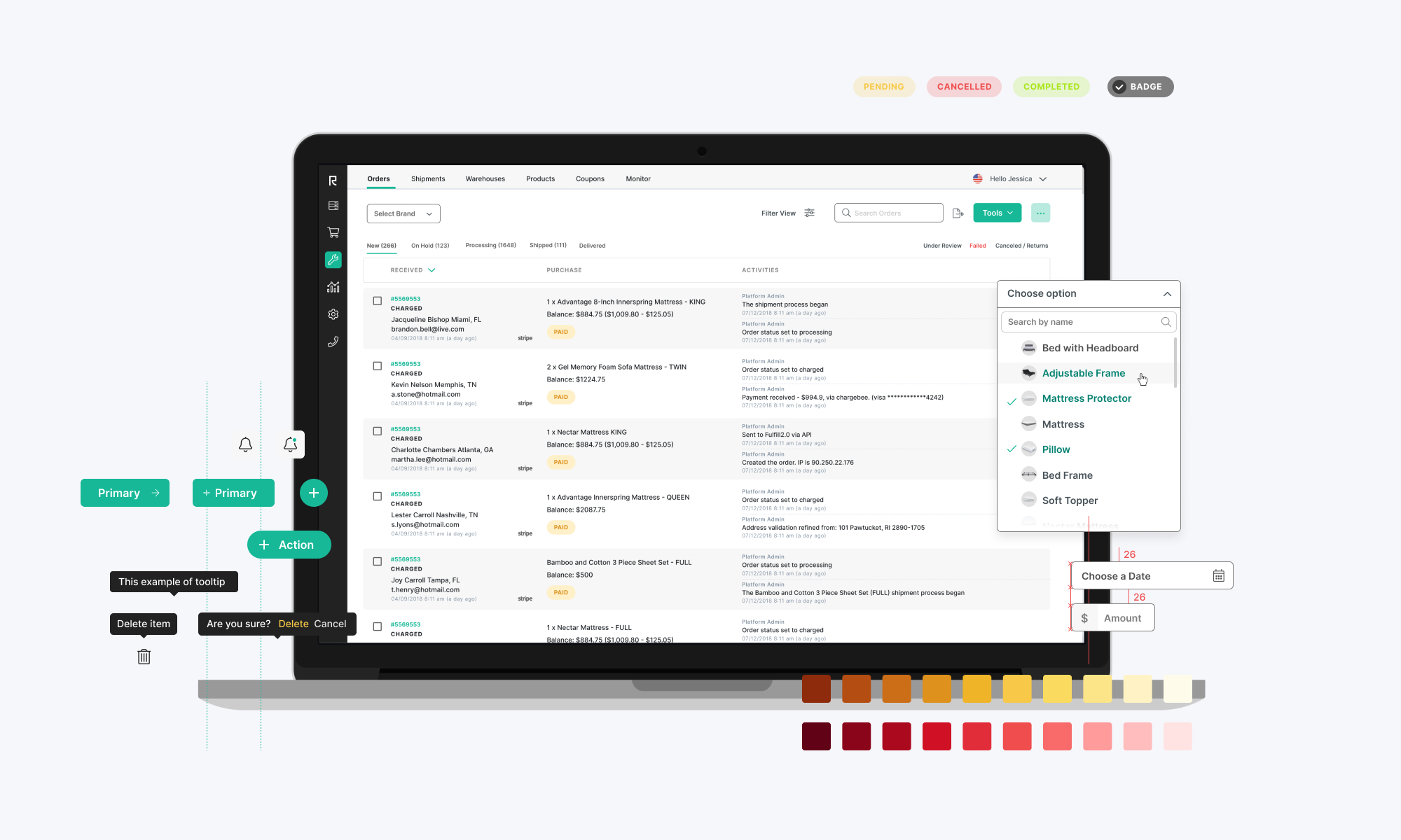
The system is predominantly white, black and gray. It’s important the design doesn’t distract from the content, so subtlety is key. Brighter colors are used to convey meaning. Our primary color - Teal - is used for primary actions and links, Yellow is for labels and info. Red is for warnings and alerts and Green is for success messages and positive alerts.
A typeface to match
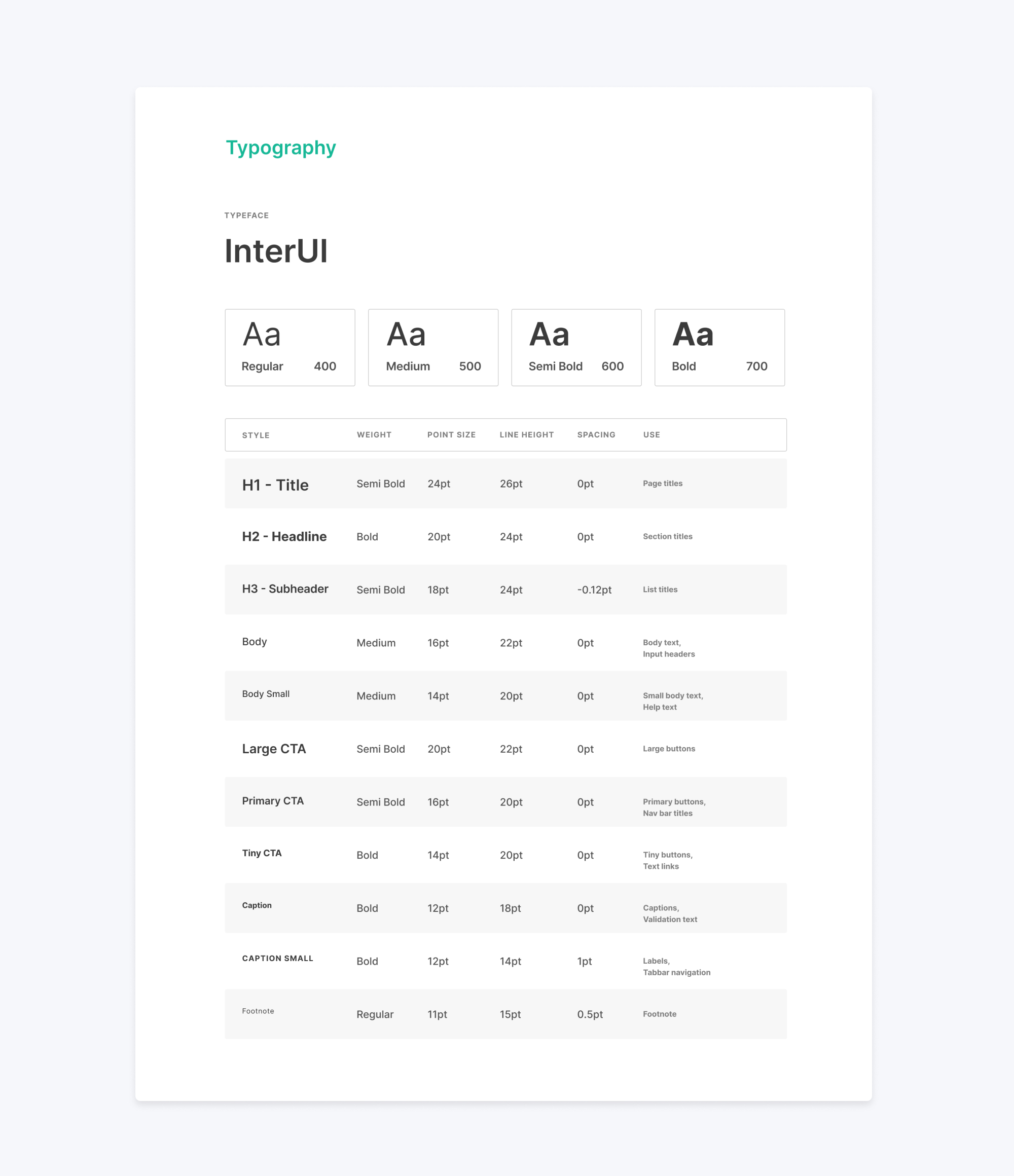
Admin Design System uses Inter UI, a typeface carefully crafted & designed for computer screens and user interfaces. It has many weights and styles which allow getting the best of both sharpness and readability.
design strategy
Product Design Thinking
It is vital to create a design system using products it will be applied to, with real data and problems. My goal here was to design a system that best meets our requirements —both business and customer needs.
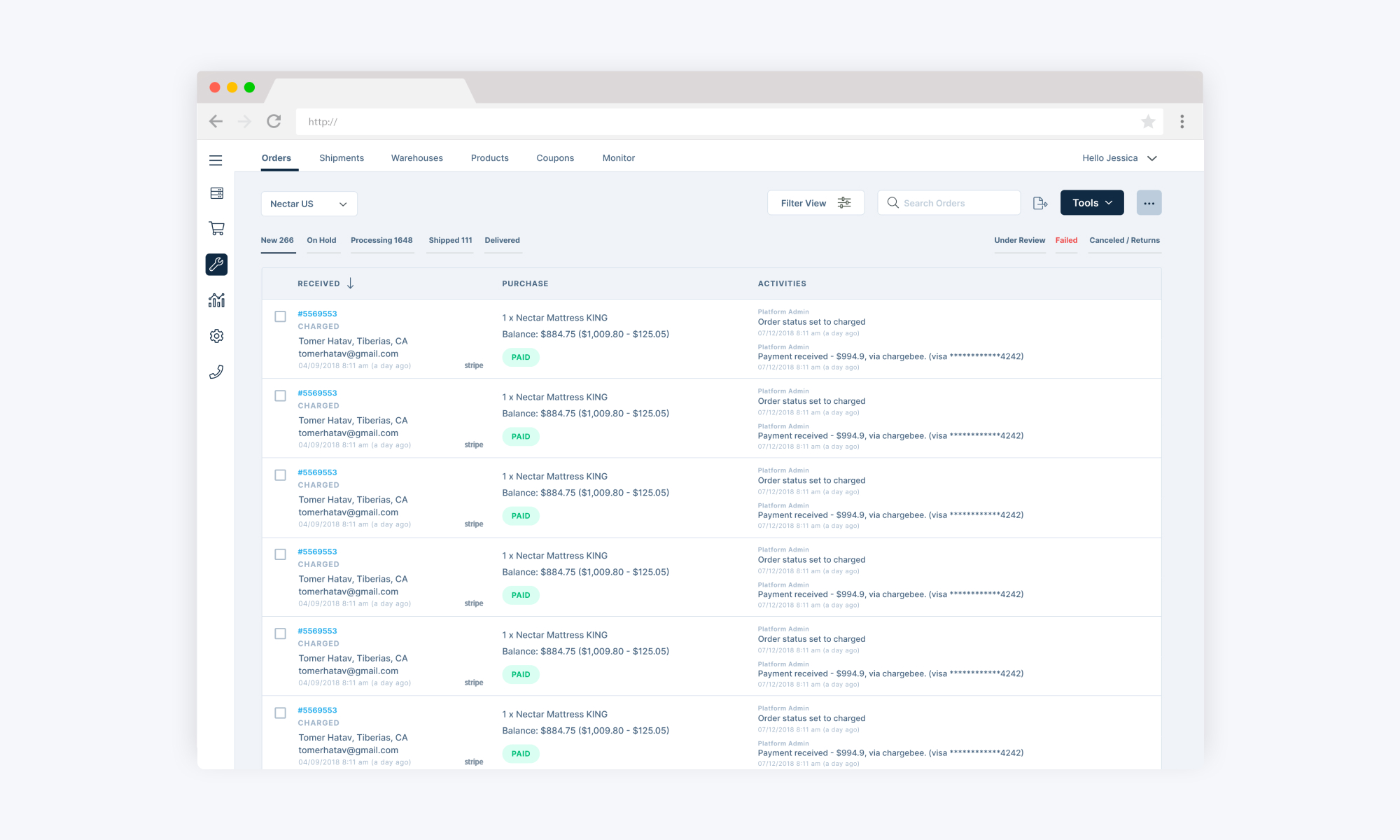
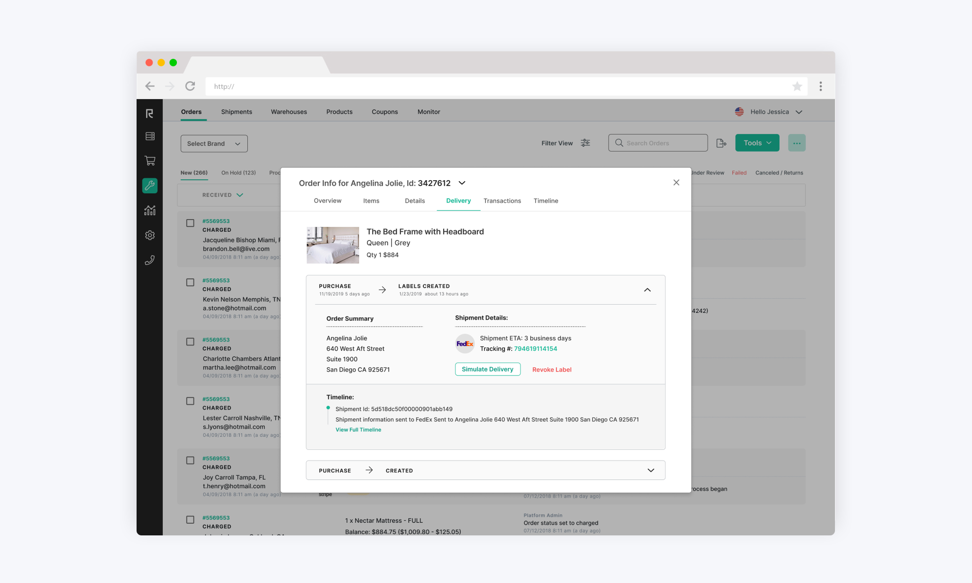
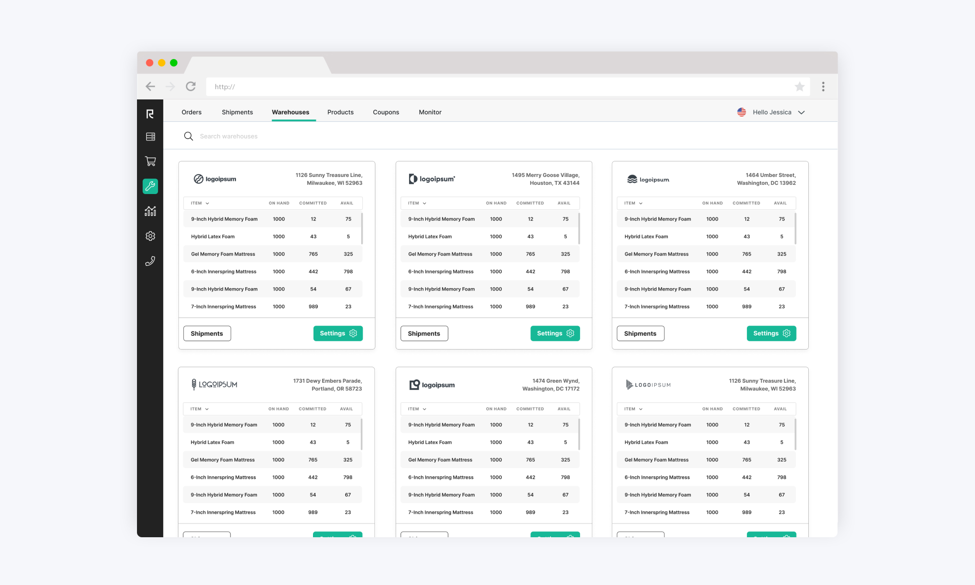
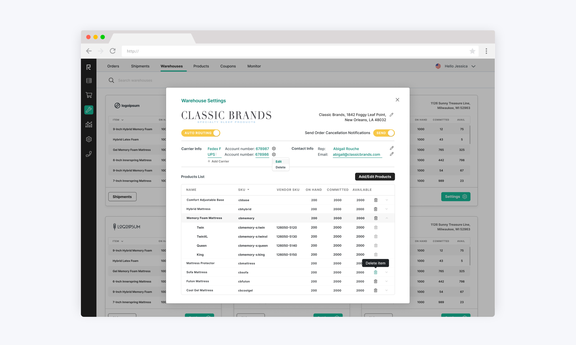
Our custom-built CMS allows our Customer Success and Ops teams to add, edit and manage customer orders for all products and brands from our core marketing sites. It also manages a huge database of information relating to our vendors and products.
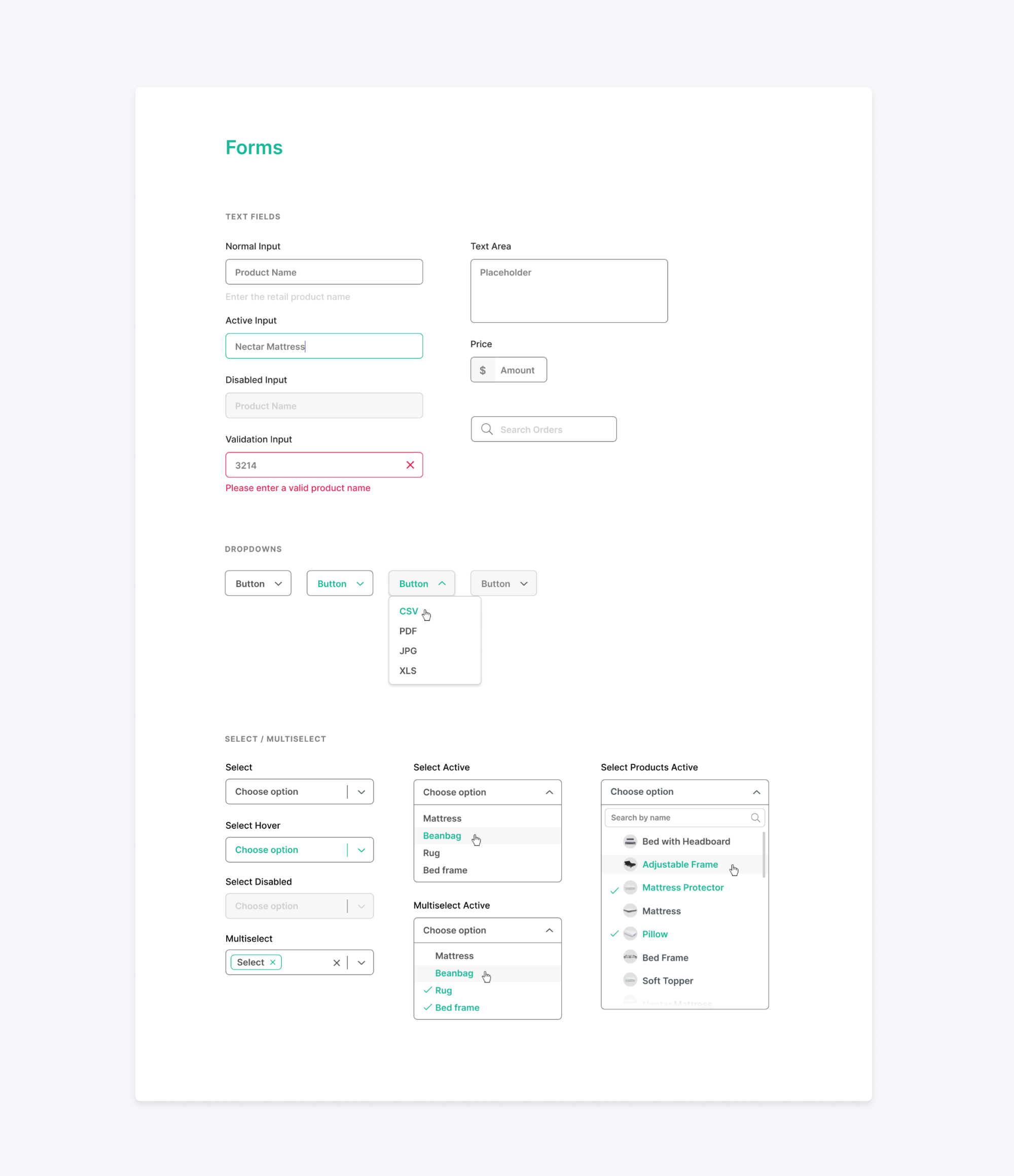
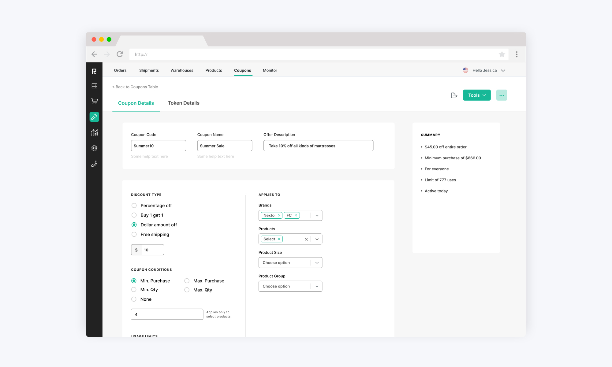
That’s a lot of info resulting in many tables, form inputs, filters, and navigation. I worked to ideate, apply, and iterate on the system as it applied to this product.
On responsiveness
Admin is designed to be responsive. However, we realized that the people - mainly managers - who are logging in to our system from mobile devices are looking to interact with the platform in a limited fashion so there was no need for all of our extensive tools and options to be responsive. And so we opted for a limited view on mobile.
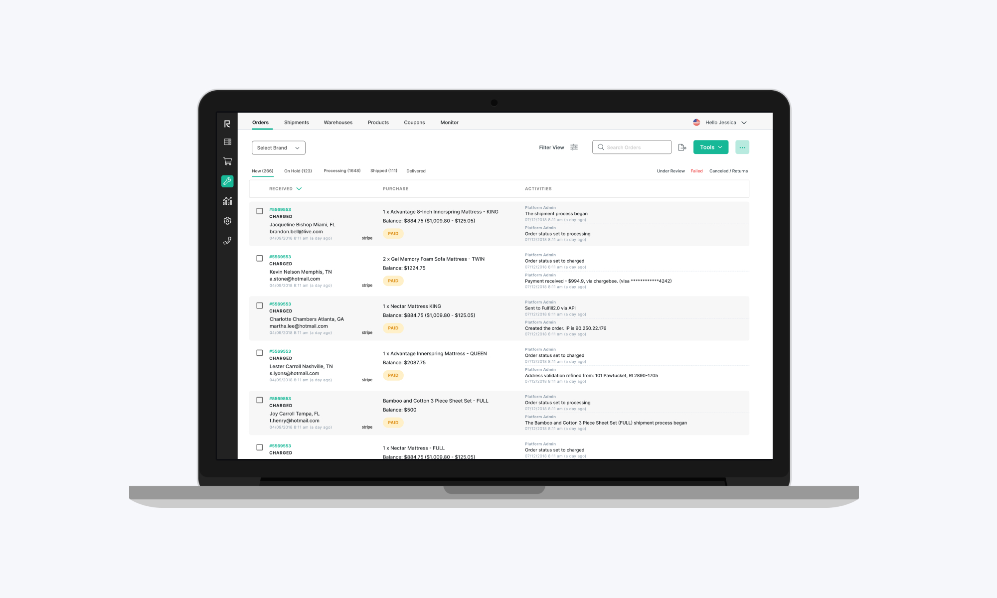
Below are some samples of UIs from this product.
building a solution
Design Library
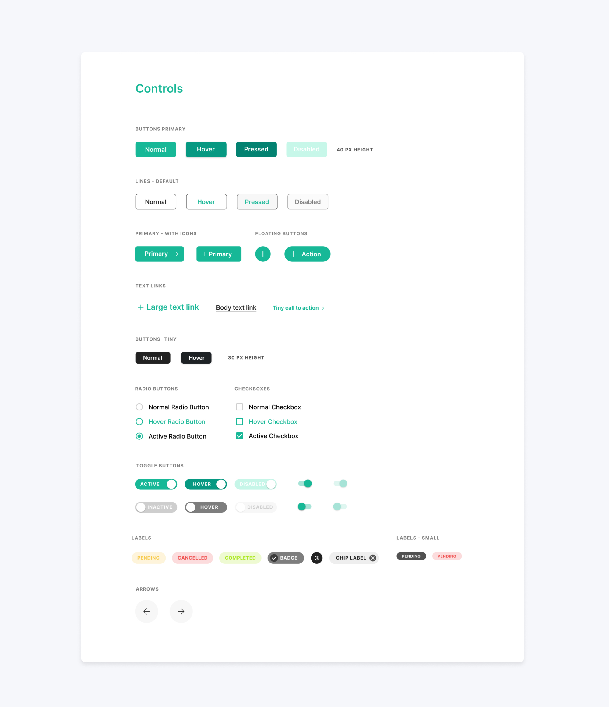
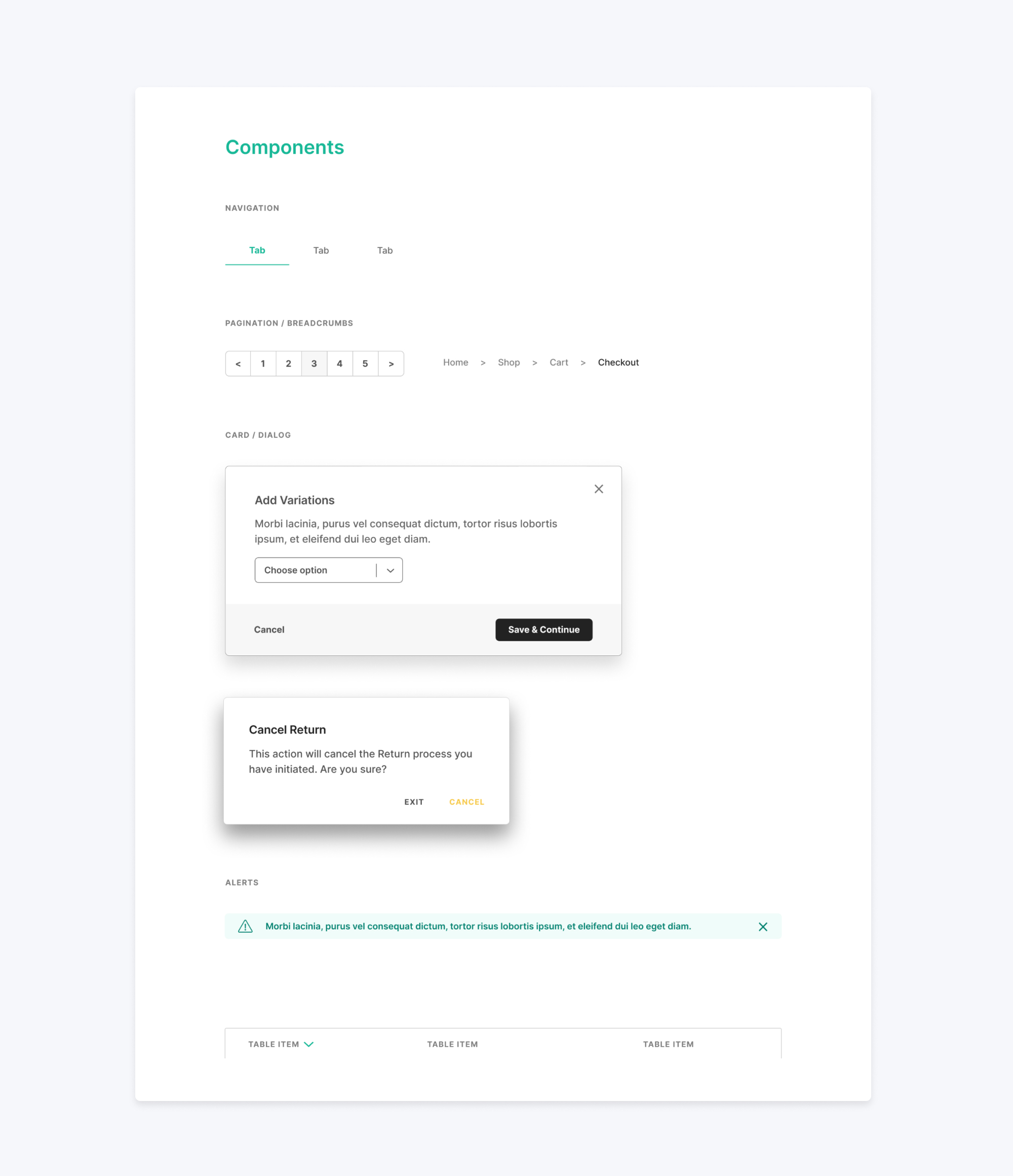
After we arrived at a style we were happy with - the task now was to create an extensive library of patterns and components, accounting for all states — essentially creating a comprehensive UI kit for our team to use.
The Best Tool for the Job
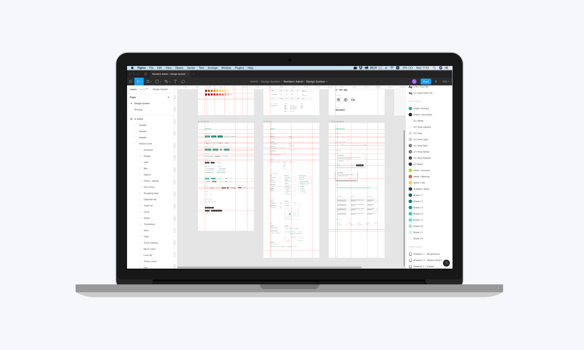
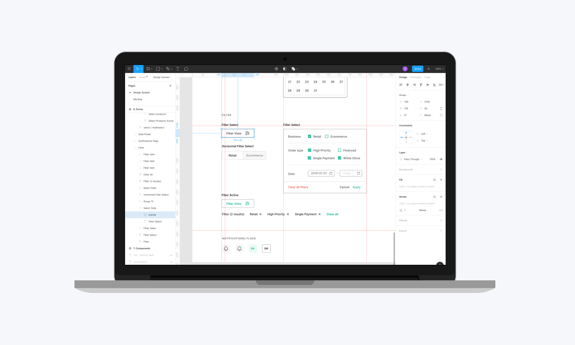
Our tool of choice for the UI design library is Figma. When you’re creating hundreds of editable components and easily applicable text styles, Figmas simplicity and accessibility made it the obvious choice.
Figmas design system is saved in the cloud, which allows for the libraries to be easily accessible to anyone on the team. It also includes a flexible search for all assets needed in a drag and drop style.
Admin Library at work in Figma. This is a glimpse of our master Figma file for Admin.
Building a Solution
The development team is hard at work developing the system and rolling it out into the CMS products you saw earlier. We are learning a lot in the process, and aim to gain valuable feedback from our global staff using our tools and iterate on the system.
I hope you enjoyed reading about the process and take a look at this before and after view of our Dashboard with and without the design system! :)
